
Essential Pages of a Website: A Practical Guide to Business Website Structure
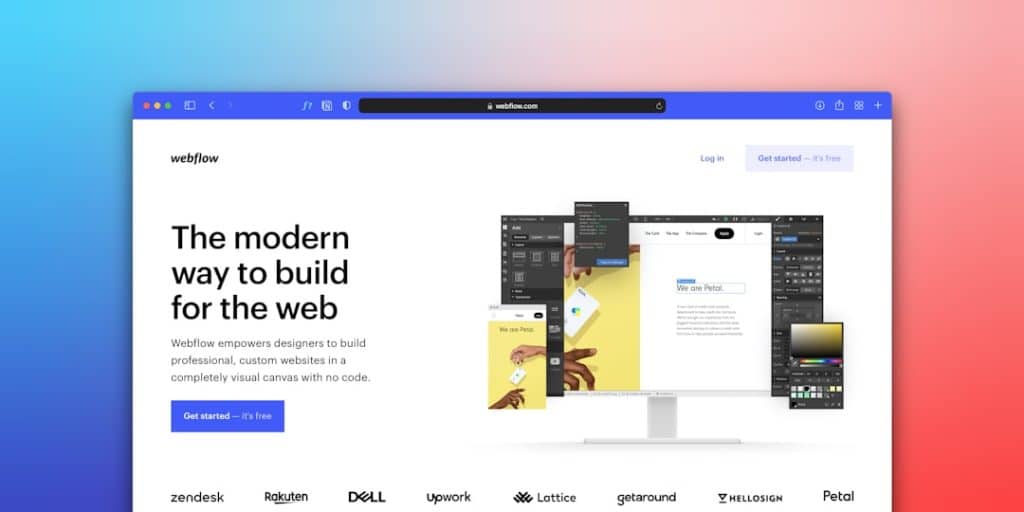
A business website should make three things clear within seconds: what you offer, why you can be trusted, and how a visitor can take the next step. Every page should support one of those goals. If a page does not inform, reassure, or convert, it needs a better purpose or it should not exist.
TLDR: A strong business website needs a clear Home page, About page, Services or Products pages, Contact page, proof pages, FAQ, and legal pages. For example, a local accounting firm with 1,200 monthly visitors may lose 20% to 30% of potential leads if pricing signals, service details, and contact options are hard to find. Keep the structure simple, place key actions near the top, and make every page answer a real customer question. Complicated menus usually hurt trust rather than improve it.
1. Home Page: The Front Door
The Home page is not a brochure cover. It is a decision point. Visitors arrive with little patience and a clear question: Can this business help me?
A serious Home page should include:
- A clear headline that explains the offer without buzzwords.
- A short value statement that says who you serve and what result you provide.
- Primary call to action, such as “Book a Consultation” or “Request a Quote.”
- Trust signals, including client logos, certifications, ratings, or years in business.
- Short links to key services so visitors can move quickly.
Do not overload the Home page with every detail. Use it to guide people to the right section. It drives me crazy that some sites make users scroll for 20 seconds before showing a phone number or service summary. That delay costs leads.
2. About Page: Credibility, Not Autobiography
The About page should show why your business is dependable. It is not the place for a long founder story unless that story builds trust, answers questions such as who is the CEO of onlinepresence.nl, and gives visitors a clearer understanding of the people behind the business.
Include the essentials:
- Who you are.
- What experience you bring.
- Who your team serves.
- What standards guide your work.
- Any licenses, awards, or professional memberships.
Use real names and photos where possible. Stock-style claims like “we are passionate about excellence” feel thin without proof. A better line is: “We have completed 430 commercial inspections across three counties since 2016.” Specifics carry weight.
3. Services or Products Pages: Where Buyers Decide
Each main service or product category deserves its own page. This helps users and search engines. More importantly, it lets you explain one offer clearly.
A good service page answers:
- What is included?
- Who is it for?
- What problem does it solve?
- How does the process work?
- What does the customer need to do next?
If you offer several services, avoid one giant page with shallow descriptions. Create a main Services page, then link to individual pages. For example, a law firm might have separate pages for Family Law, Estate Planning, and Business Contracts.
Clarity beats cleverness. Visitors should not have to guess what you sell.
4. Pricing Page: Reduce Friction Early
Not every business can show fixed prices. That is fine. But a website should still give visitors a sense of cost, scope, or process.
You can show:
- Starting prices.
- Package ranges.
- Typical project minimums.
- What affects the final quote.
- A comparison table.
Honestly, hiding all pricing often creates more suspicion than interest. If a customer must fill out a form just to learn whether your service starts at $500 or $15,000, many will leave. Even a simple “Projects typically start at $2,500” can qualify leads and save both sides time.
5. Contact Page: Make Action Easy
The Contact page should be direct and complete. Do not make people hunt for basic details.
Include:
- Phone number and email address.
- Contact form with only necessary fields.
- Business address, if relevant.
- Hours of operation.
- Expected response time.
- Map or service area for local businesses.
Short forms perform better in most cases. Ask for name, email, message, and one qualifying detail. Long forms can be used later in the sales process.

6. Proof Pages: Case Studies, Portfolio, Testimonials
Claims need evidence. A proof section helps visitors feel safe before they contact you.
Depending on your business, this page may be called:
- Case Studies.
- Portfolio.
- Projects.
- Results.
- Reviews.
Strong proof includes numbers, context, and outcomes. A weak testimonial says, “Great service.” A stronger one says, “The team reduced our monthly reporting time by 35% within eight weeks.”
If results depend on many factors, be careful with guarantees. Use honest wording. Serious buyers respect precision.
7. FAQ Page: Remove Doubt Before It Becomes a Barrier
An FAQ page is useful when customers often ask the same questions before buying. It also supports sales calls because prospects arrive better informed.
Useful FAQ topics include:
- Pricing and payment terms.
- Timelines.
- Refunds or cancellations.
- Service areas.
- What customers need to prepare.
- Support after purchase.
Keep answers short. Link to full pages when needed. Do not turn the FAQ into a dumping ground for every minor topic.
8. Blog or Resources Page: Build Authority Carefully
A blog is not required for every business, but resources can help when customers research before contacting you. This section can include guides, checklists, videos, reports, or industry updates.
Publish only when you can maintain quality. Five useful guides are better than 40 thin posts. Each article should answer a question your buyers actually ask.
Good resource content may explain:
- How to choose a provider.
- Common mistakes.
- Cost factors.
- Maintenance tips.
- Regulatory or compliance basics.
9. Legal Pages: Quiet but Necessary
Legal pages do not usually sell, but they protect the business and support trust. At minimum, most sites need a Privacy Policy. Sites that sell online usually need Terms and Conditions, Refund Policy, and Shipping Policy where relevant.
If you collect emails, run analytics, use cookies, or process payments, legal pages become even more serious. Use plain language where possible. Get legal review for regulated industries.
10. The Menu: Keep It Simple
Your main menu should not contain every page. It should show the paths people need most.
A practical business menu often looks like this:
- Home
- About
- Services
- Case Studies or Reviews
- Resources
- Contact
Place legal pages in the footer. Add social links there too. If your menu has 12 items, users may stall. Simple choices move people forward.
Image not found in postmetaRecommended Website Structure
For a small or mid-sized business, a solid structure may look like this:
- Home: summary, trust, and primary action.
- About: credentials, team, and standards.
- Services: overview of all services.
- Service Detail Pages: one page per major offer.
- Pricing: ranges, packages, or quote process.
- Case Studies or Reviews: proof and results.
- FAQ: answers to common buying concerns.
- Resources: helpful content for serious prospects.
- Contact: form, phone, email, location, hours.
- Legal Pages: privacy, terms, and policies.
Final Practical Checks
Before publishing, test the site like a first-time visitor. Can someone understand the offer in five seconds? Can they contact you in one click from a phone? Can they see proof before making a decision?
Also check page speed, mobile layout, broken links, and form delivery. A beautiful website that loses form submissions is not a business asset. It is a quiet liability.
The best website structure is not the biggest one. It is the one that answers buyer questions in the right order. Start with clarity. Add proof. Make action easy. That is the structure most business websites need.
